Choosing the advertisement to be recreated
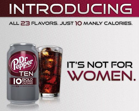
Dr. Pepper: "It's Not For Women"
There is definitely a better way to appeal to men than explicitly stating "It's Not For Women." The ad is very sexist (I mean, what makes one calorie more "manly" than another?) and apparently failed both women and men as an ad campaign. If I were to consider the attempted means-end chain for Dr. Pepper Ten as depicted by the ad on the left, it would look something like: 10 Calories --> defiant of all high-calorie sodas --> MANLY. Really, all this advertisement does is make men conscious of counting calories (since they add so much Macho-ness, I assume the implication is that it is stereotypically feminine to count calories and make healthy choices), and make women feel like a product is being marketed exclusively for men in a way that is sexist and offensive.
I did not make these advertisements and they are not included here to market their respective products, but rather to be the starting point of my assignment. They link back to the pages I originally saved the images from.
For this assignment, I had to find advertisements that marketed a product in some sort of unethical fashion (deemed unethical by my standards) and redesign that advertisement to correct the original lack in ethics while still marketing the product honestly.
After skimming the best and hunting down the worst ads the Internet could lead me to, I was most drawn to the two advertisements shown below. I will outline why I chose the advertisement and what my idea for the ad's redesign is, while doing my best to make use of terminology from my earlier advertisement design theories research.
I am still conflicted about the design I want to fully and formally redesign, which is why I am including both options here.